Text/Word Works
Some of my early conceptually oriented work used text and/or words in a “concrete” or material sense. Some of this work suggests the influence of concrete poetry, a literary hybrid genre that gained international stature in the early 1950's. Concrete poet, Emmett Williams describes the intent of the makers of these poems: The visual element in their poetry tended to be structural, a consequence of the poem, a 'picture' of the lines of force of the work itself, and not merely textual. It was a poetry that used, in Williams' words: The semantic, visual and phonetic elements of language as raw materials in a way seldom used by the poets of the past. (Williams 1967) While the connection between early text works like Sign Patterns (1974) and Countdown (1990) and concrete poetry is based largely on a shared “visuality,” these text experiments tend to be self-referential while also alluding to ideas beyond or in addition to the material itself, for example, “texture,” or “textiles” in Sign Patterns, and a "launch sequence,” or the initiation of the final decade of the last century, suggested by Countdown. That is, these works are mainly concerned with their own lexical structure, similar to some forms of concrete poetry, but without necessarily lending the words or material a “pictorial” quality, specifically where the typography of the work acquires an iconic aspect. These text works, then, also seem related to conceptual art. This understanding raises the possibility that there is a spectrum of creative language use, with text or word works related to conceptual art at one end of the spectrum and traditional or metered poetry at the other, with concrete poetry somewhere in between. Typography, spacing and how words are placed on the page in relation to each other are not the main differences between these three approaches to language use. The primary differences seem to be either “pictorial” and/or referential. For a late conceptual approach to the use of text art see my Trilogy of Book works in the following archive link.
Anthology of Concrete Poetry, Emmett Williams, Editor. Something Else Press, 1967. p. vi.
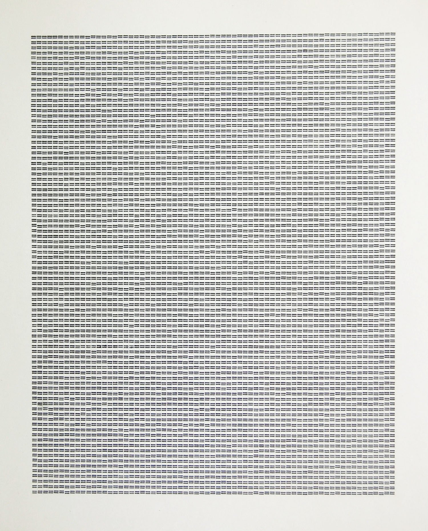
Sign Patterns 1974 Artist’s Book, typewriter signs on paper, 8.5x11 inches.
In the summer of 1974, I hammered out nine pages of keyboard signs on a small Olivetti manual typewriter, one sign per page: Seven punctuation marks, a plus sign, and the letter x (I avoided denotative signs such as ? or !). I typed each sign one at a time in single spaced rows over and over until a block or pattern of signs was completed. The work, an experiment finished over the course of a couple of days, was motivated by the idea that such signs constituted ready made material that could be repurposed in a primarily optical way. The repetitious typing creates an illusion of “vibration” within the patterns (and in the case of the x, a subtle illusion of color); a kind of visual residue of the energy that went into making the work. This may have something to do with the nature of the typewriter used. Non-electrical manual typewriters of that time usually produced uneven letters and symbols due to the inconsistent pressure of the hand during typing; condition of the ink ribbon, as well as other factors. The process of typing on these machines, while somewhat impersonal, required the kind of physical focus that enabled the typist to “find a rhythm,” and an awareness or sense that one was actually making something by virtue of the machine (or tool) being an extension of the hand. This fundamental notion of making (and marking) has been brought to the fore in Sign Patterns through the repetitive typing or riveting of single signs.
Sign Patterns is a reductive work with a conceptual orientation. In this context the patterns might be viewed as “mechanical drawings,” which, in addition to their optical effects, are also evidence of the process of typing, making each pattern as a whole, a sign. The meaning of these sign patterns raises a fundamental tenet of literary theory, insofar as they can be “read” as “woven” fields of visual texture. That the signs are contained by the margins of the page suggests or simulates the form of a text. One subject addressed by literary theory is the concept of text, the origin of which is the Latin textum, or fabric. The word “text” was first used by Roman rhetorician, Quintilian, who advised the writer that after having chosen the (presumably correct) words, “they must be weaved together into a fine and delicate fabric.” (Institutes of Oratory, 95 AD.) Text from the viewpoint of literary theory is mainly concerned with message content, not the physical means or medium through which that content is expressed. But if we allow that the sign patterns can be read as visual texture then they might be construed as having content; that they transmit a meaning. A literal meaning that centers on the etymologically related terms, “text” and “texture.” Thus, an important component or element of text, punctuation, is redeployed as a series of signs forming optical “texts” while also alluding to a classical trope concerning the process of writing.
Wad Book 1976 Light blue paper, wadded into a ball, photocopied and re-wadded. 8.5 x 11 inches. Edition of five. (Re-created 2025)
In the summer of 1976, almost twenty years before British artist Martin Creed thought of crumpling a sheet of typing paper into a ball and presenting the notion as a possible artwork,1 I actually made such a work in a limited edition of five. However, unlike Creed’s work, which was included in a set of typed instructions and meant presumably as proposed artwork, my Wad Book of 1976 was not only actualized but also taken a step further through the process of photocopying the wadded (and flattened) ball. The resulting photocopy was in turn wadded, uncrumpled and smoothed out revealing the image of the original wad in the center of the paper. Unlike Creed’s idea this reflexive representation instantiated the process of wadding, combining the wadding of the paper with a visual representation of the result of that process.
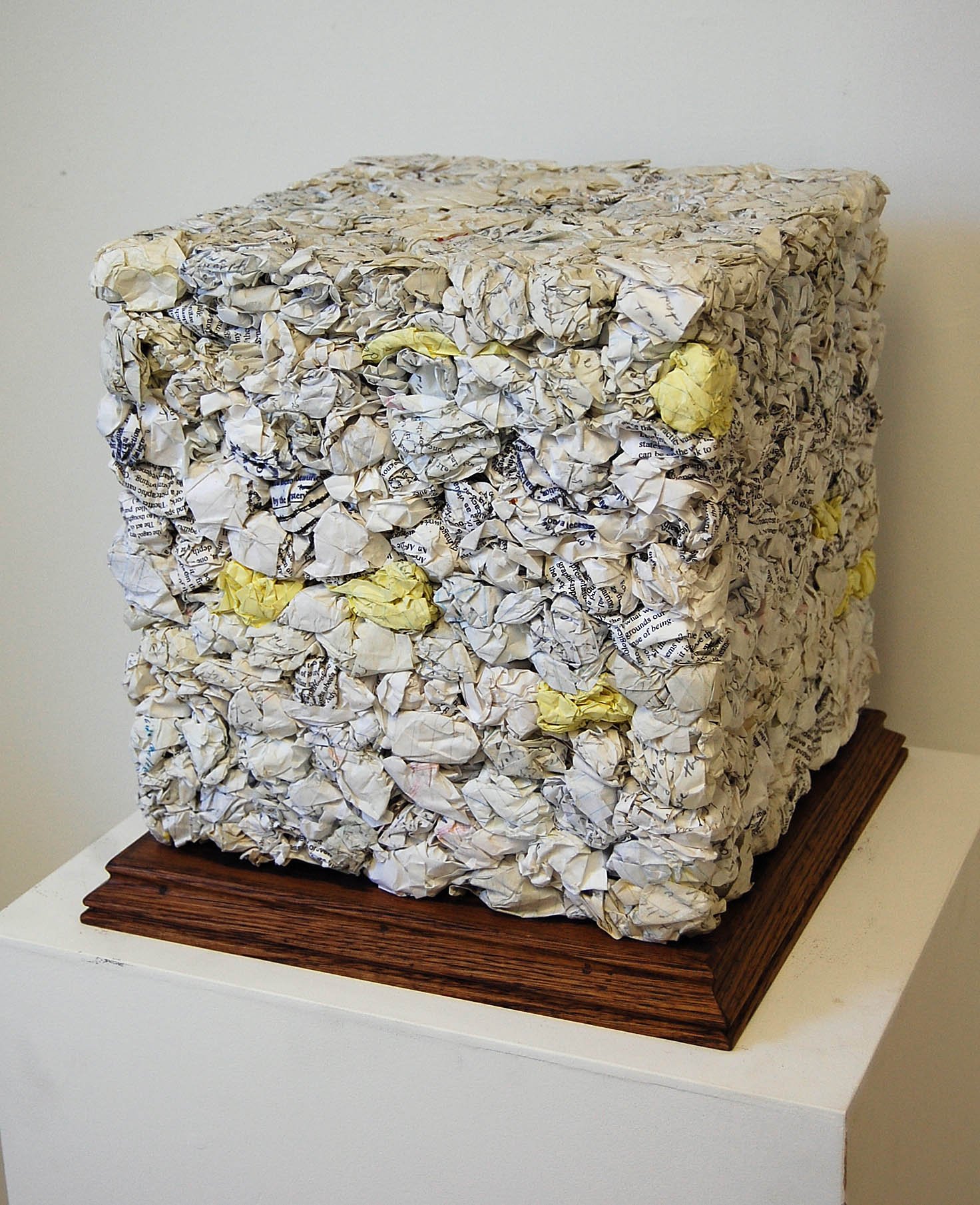
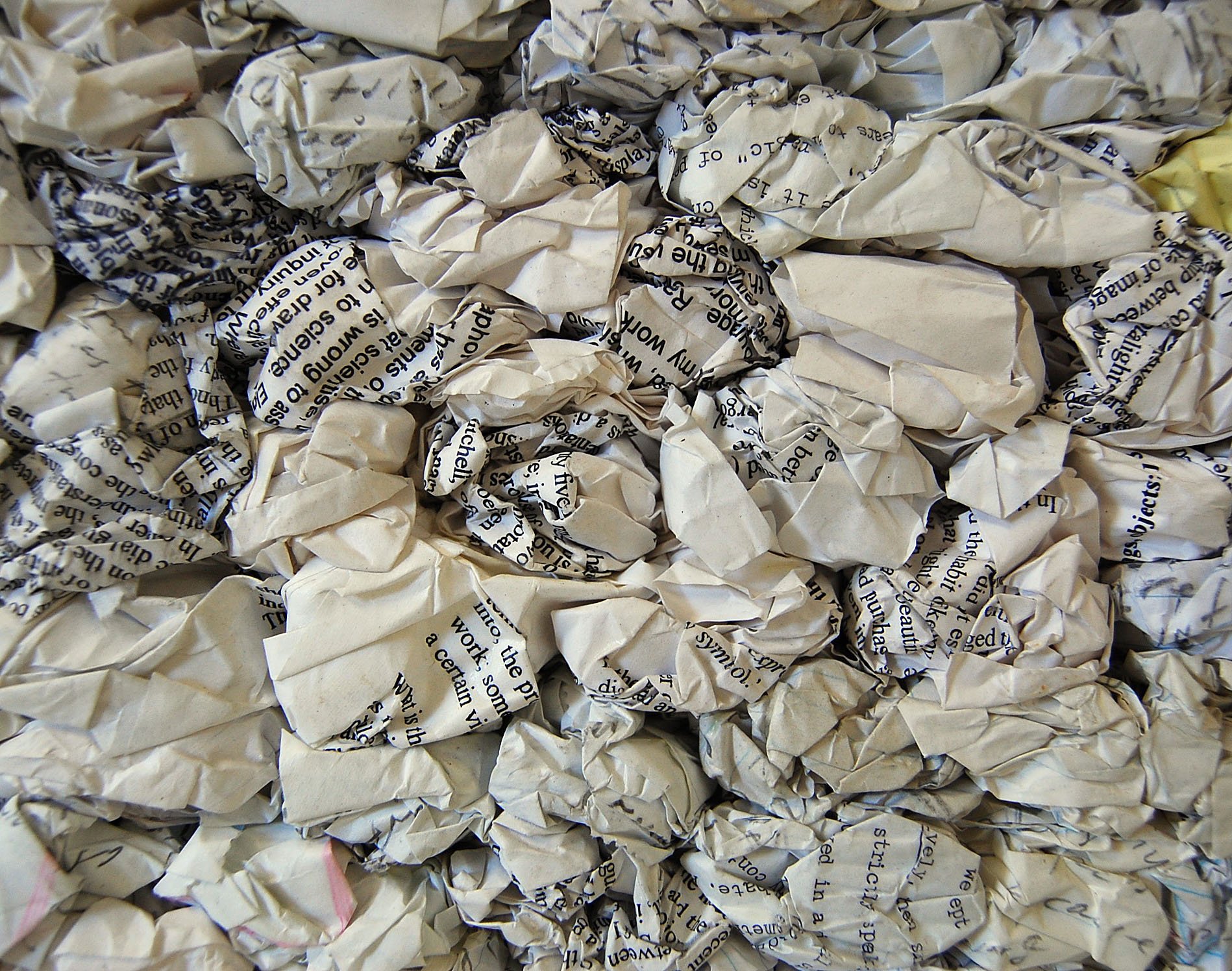
Many of my early post-conceptual artworks from the mid 1970s were made from found things that I referred to as “Poem/Objects.”2 Much of this work manipulated common materials and/or objects in ways meant to transform these things into a kind of palpable poetry, things that could be literally grasped, held in the hand. Two of my artistic concerns that summer were (1) pushing the boundaries of what could be accepted as an “artist’s bookwork,” and (2) pursuing the ephemeral artwork, the work that might, and in this case, did disappear without a trace (beyond my memory of the piece). Wad Book seemed to fit the bill on both counts. Wad Book thus seemed to epitomize a post- conceptual poetics little understood or appreciated at the time: A sheet of paper photocopied and in turn crumpled, documenting a simple act or process; the result saved in an image that might suggest, among other things, the poverty of written thoughts. The 2025 version of Wad Book is technically different from the original work as photocopy technology has advanced since 1976. The cultural context today is also very different. The “post-modern” or post-historical art world reception of works like Wad Book has changed from curiosity and amusement to boredom and indifference. How this work is manifested and received is different, but the idea remains essentially the same; an idea that captures something of the nature of ephemeral art in both historical and material terms. What is interesting about this bit of historical ephemera is that while it disappeared from the world for a time it also sank from my memory until it eventually germinated and produced a far more substantial piece of post-conceptual poetics in 2006. That year, after having collected literally piles of my earlier writings on paper, I decided to keep, in a sense preserve all this discarded material in a unique way. The writings were wadded and pressed into a twelve-inch square cube, that I titled: Compact Record of Discarded Thoughts (see below).
1 Martin Creed, Work No. 88 A sheet of A4 paper crumpled into a ball.
2 I was unaware at the time that surrealist poet and theorist, Andre Breton also designated some of his works as poeme-objets (poem-objects).
Top right: Wad Book, 2025 crumpled and smoothed wad, color copy 8.5 x 11 inches.
Bottom right: Wad Book, 2025 crumpled paper, approximately 2 x 2 minches.
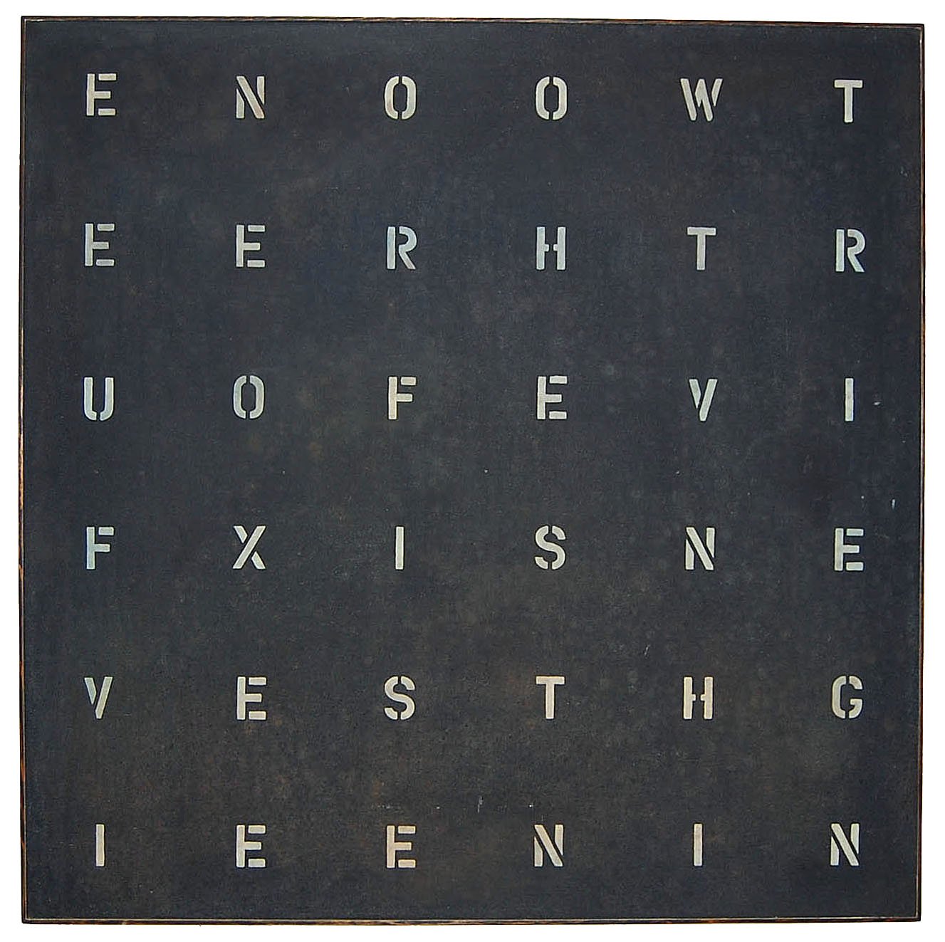
Countdown 1990 Enamel on blackboard, 48x48x2 inches. Note: Read from bottom right hand corner and right to left.
Headstone (Laying NO to Rest) 2005 Black slate, 42x22x2.5 inches. Collection Yale University Law School.
Compact Record of Discarded Thoughts 2006 Wadded artist’s writings, glue. 12x12x12 inches.
Detail: Compact Record
Apothecary 2012 Ten bottles of ink with book chapter labels on wood shelf, 50x7.5x10 inches. Left: Chapter five, Right: pouring ink. For a comprehensive text on this work go to this link.
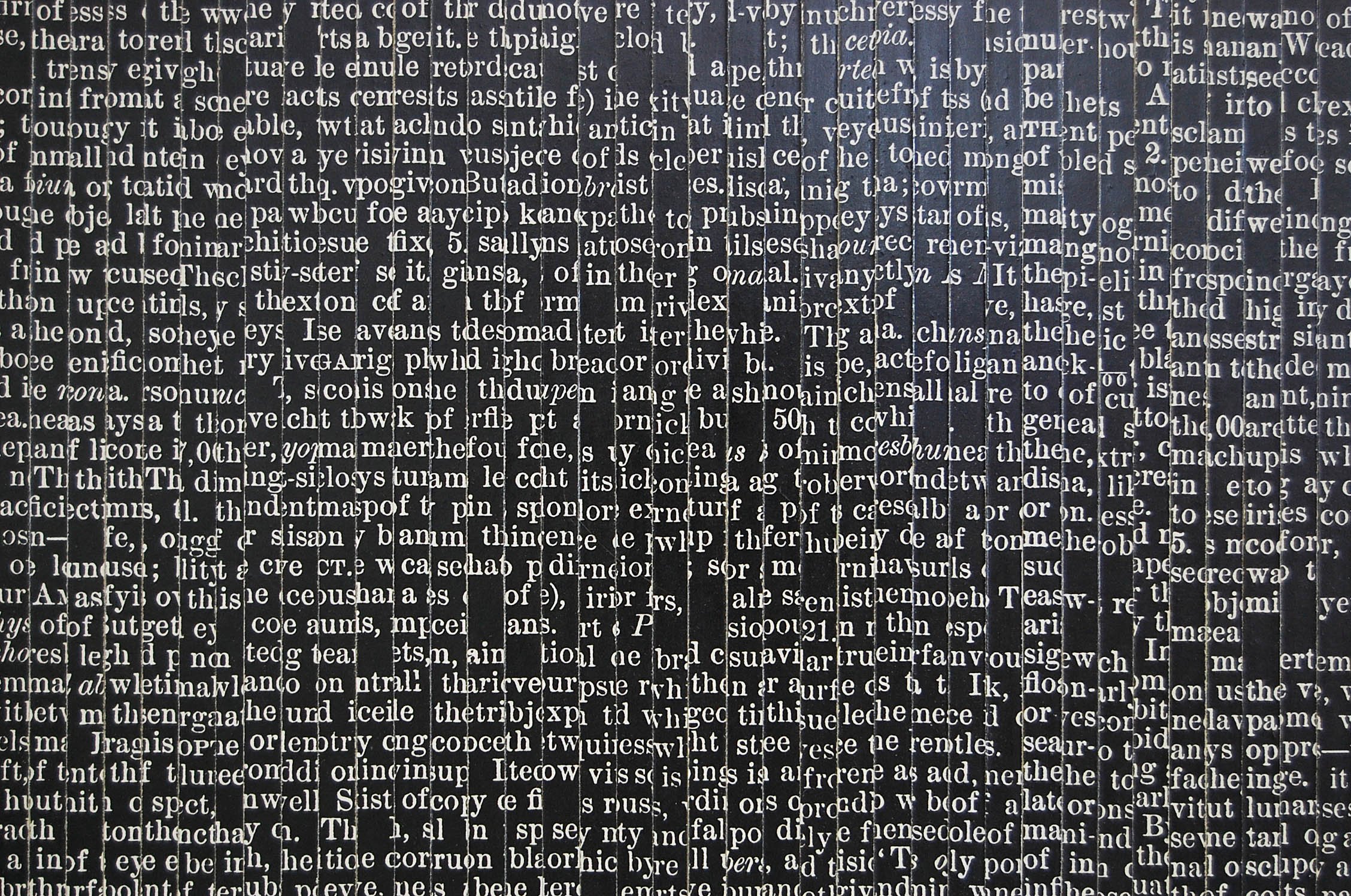
Scroll of Babel 2014 Collage on board, photocopies (text strips), 66.75x16.5x2 inches.
Detail: Scroll
Focal Point (Energy Field) 2018, Type on paper, original 5x5 inches.
Focal Point is a simple and elegant idea that has a reflexive aspect insofar as the focusing of the eye on the center of the field reveals the optical or perceptual focus in conceptual (or linguistic terms). This perceptual/conceptual focus (the word "eye" read vertically and horizontally) extends virtually indefinitely into a field of energy that is not only represented conceptually (e = energy in physics), but also has an optical quality that makes the notion of energy palpable or immediate.
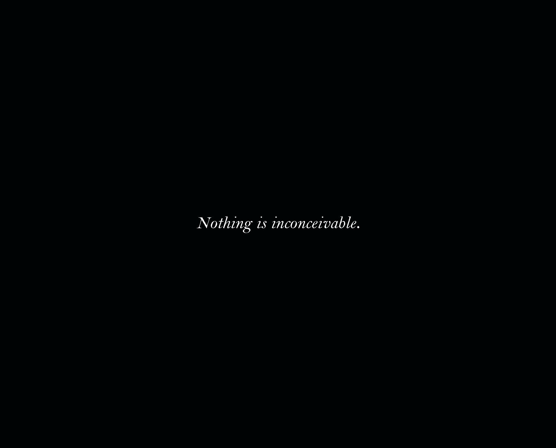
Nothing 2014, Postcard (edition of 100) 5x7 inches.
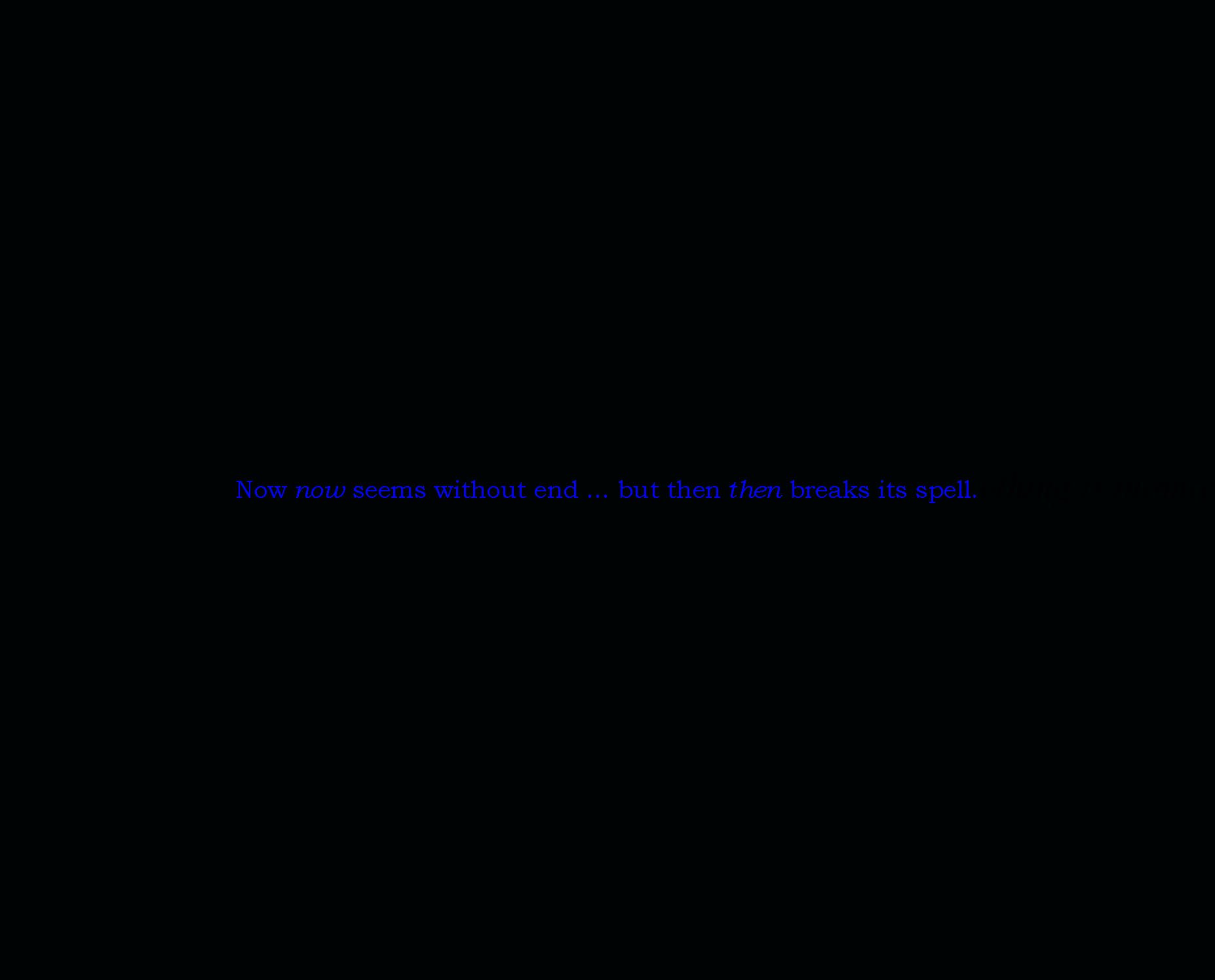
Now & Then 2018, Postcard (limited edition) 5x7 inches.
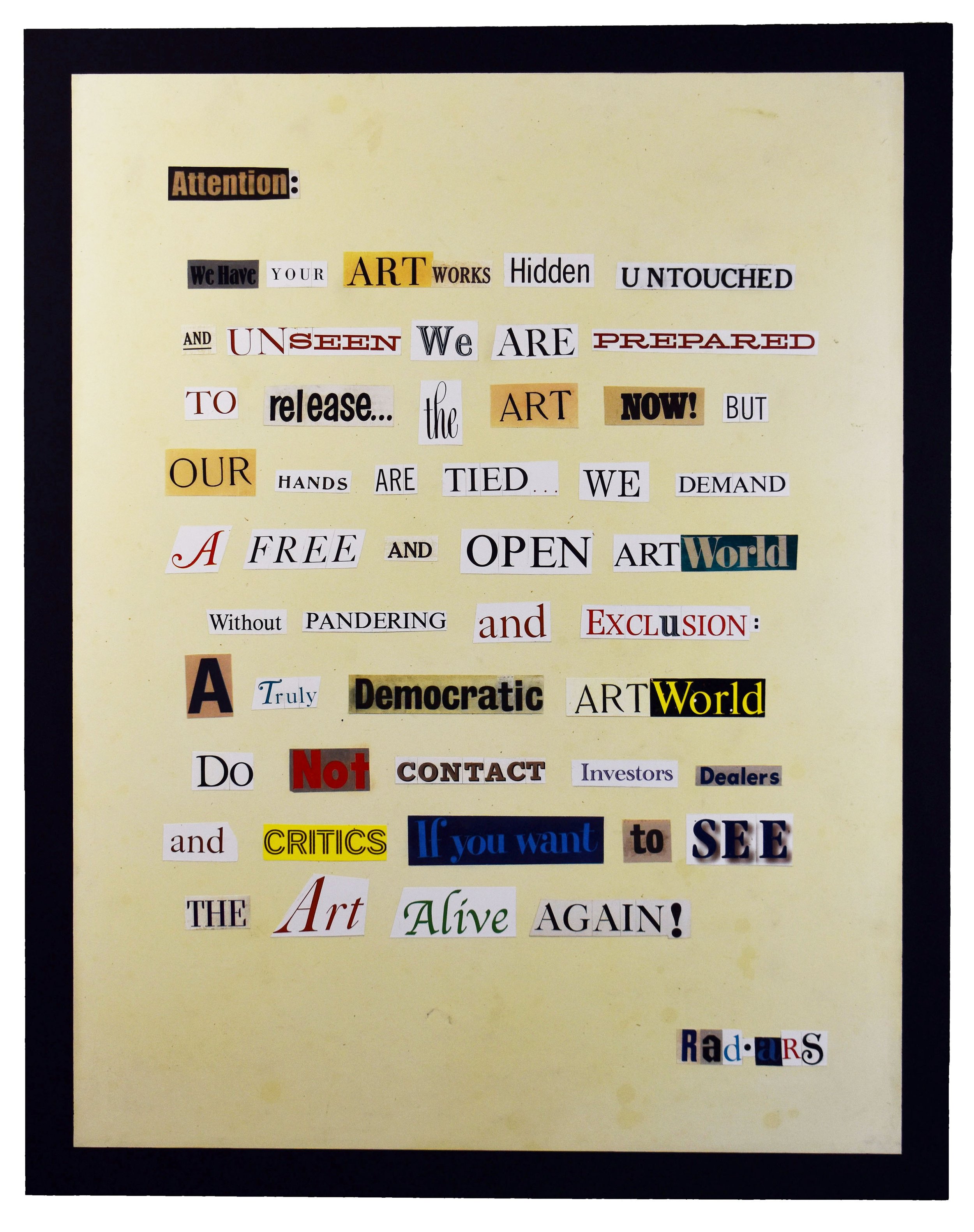
Communique 2024 Collage on paper on board, 38x48 inches.


